EN:
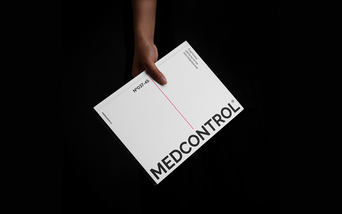
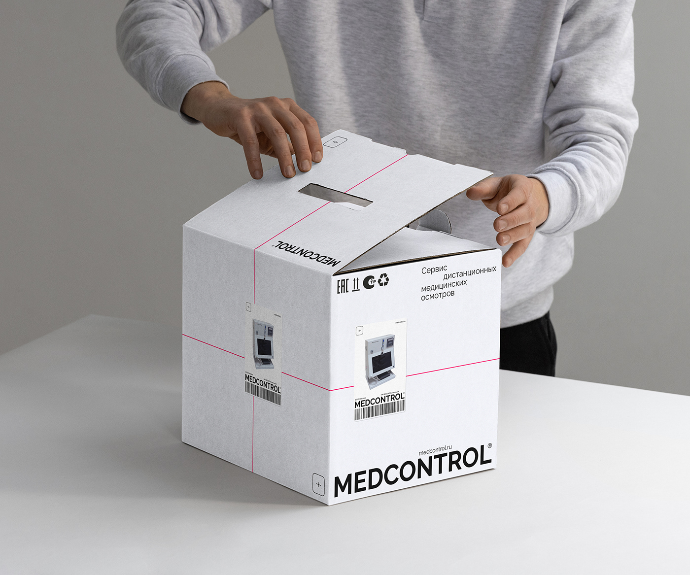
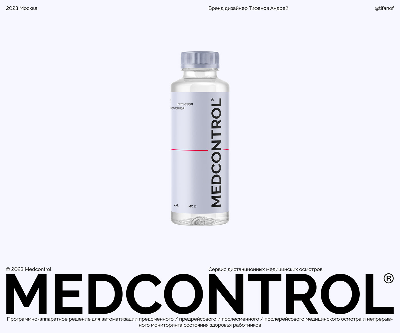
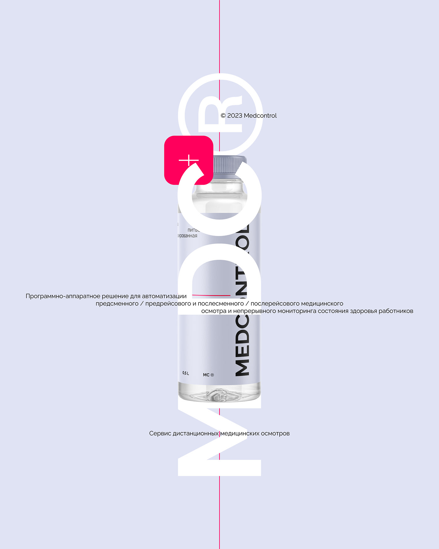
MEDCONTROL is a service of remote medical examinations.
It's not a story about a medical clinic, a pharmacy or a drug. This is a story about technology with a bias in medicine, namely:
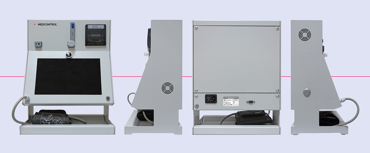
a software and hardware solution for automating remote pre-shift / pre-trip and post-shift / post-trip medical examination and continuous monitoring of the health of employees.
For this reason, when developing the corporate identity, it was decided to go towards engineering and precision in order
to emphasise this. The target audience of this product is employers who need to check the health and sobriety of their employees, as well as issue them an official permission to enter the shift, certified by a medical worker.
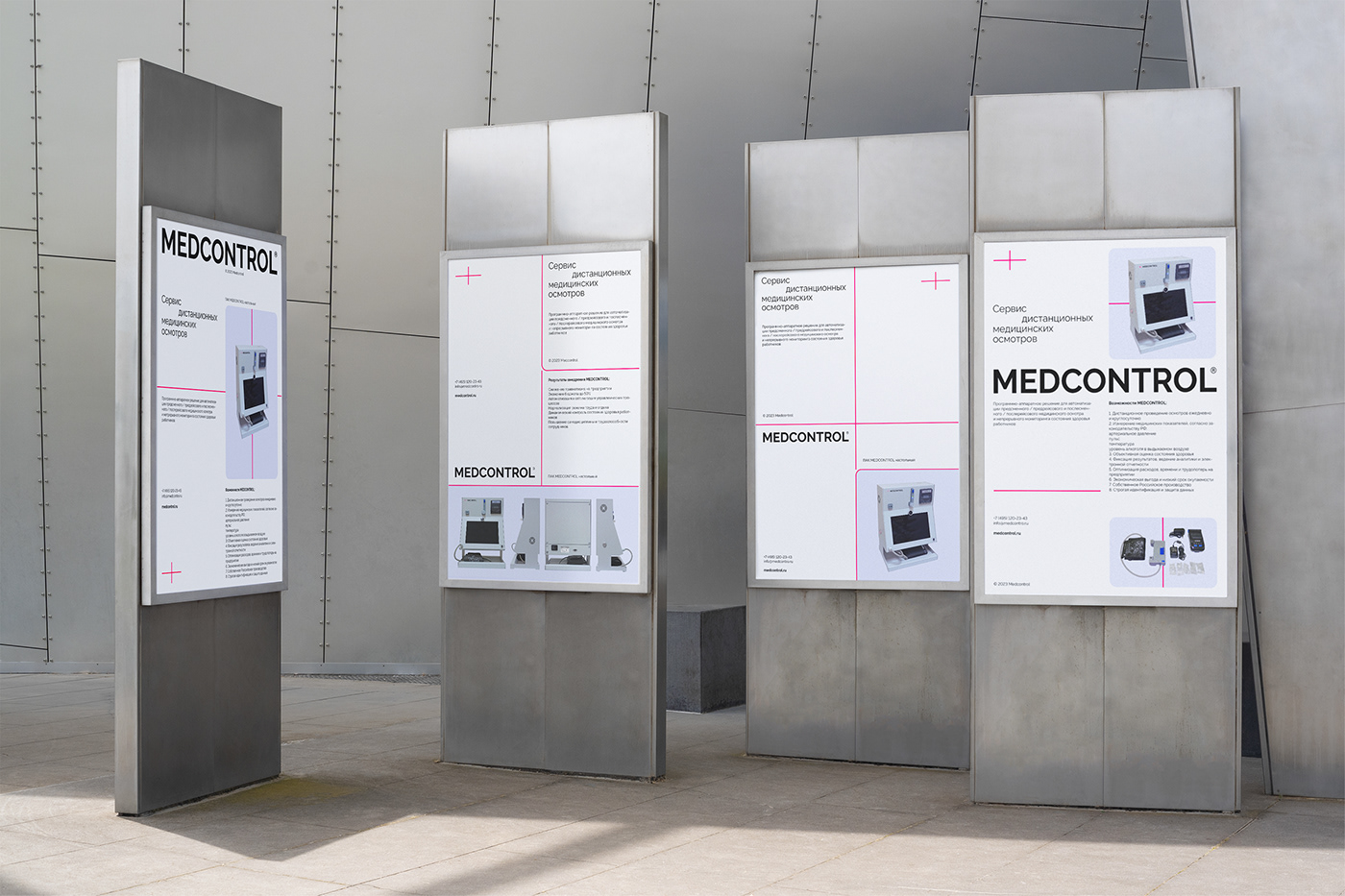
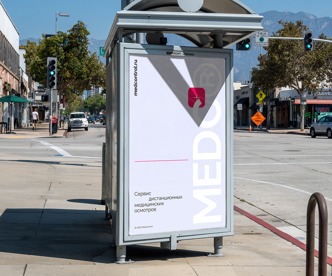
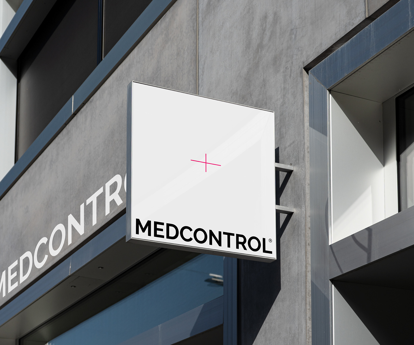
The metaphor, on which all visual identification is built, was based on control. Under control or under the gun - these are the phrases that served to create the logo. This is a medical cross made in such a style that it would look like a sight
or lens crosshair on the camera. And his red rays served as the main style-forming elements of the corporate style. They symbolise the alarm beams, hitting which the alarm will sound, just as this service will work, determining the unsatisfactory state of health of the employee before the work shift.
RU:
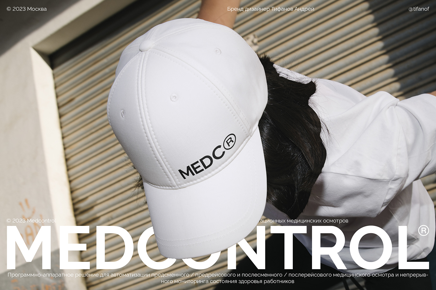
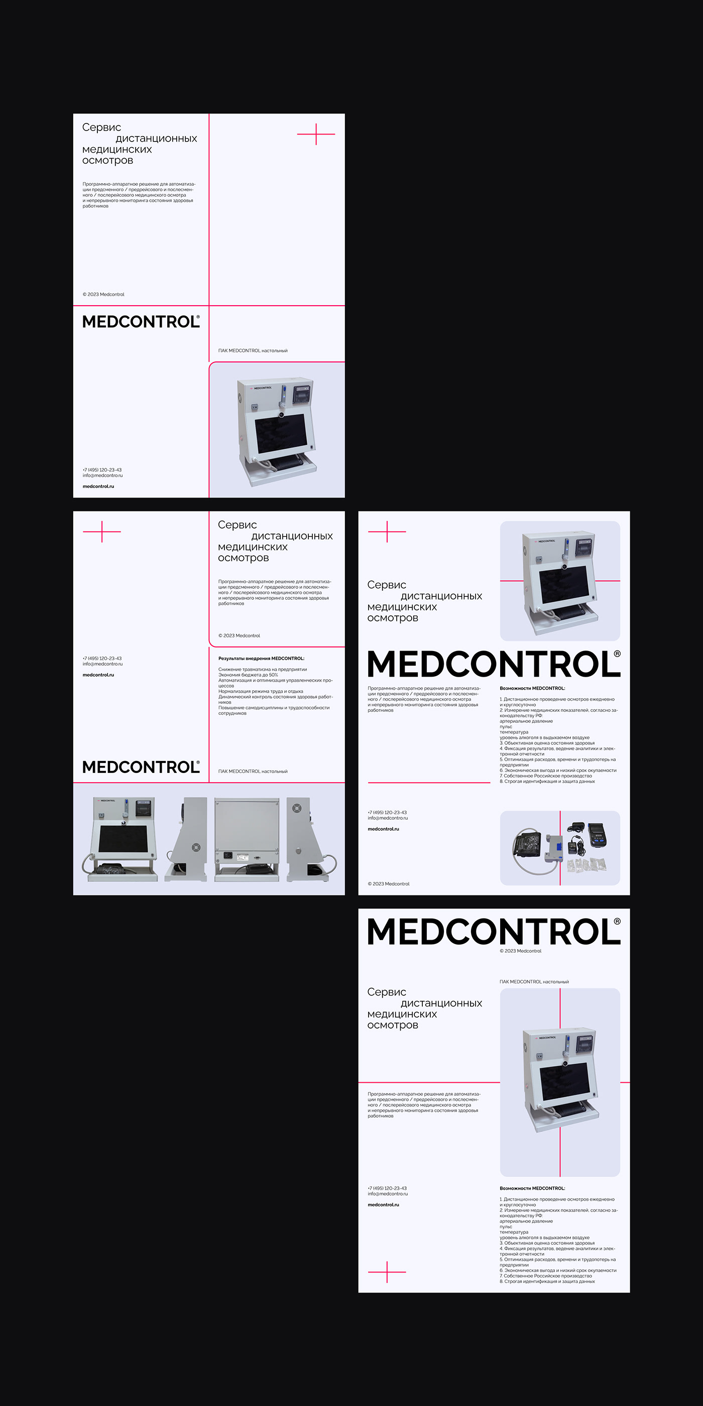
MEDCONTROL — сервис дистанционных медицинских осмотров.
Это история не про медицинскую клинику, аптеку или лекарственный препарат. Это история про технологию
с уклоном в медицину, а именно: программно-аппаратное решение для автоматизации удалённого предсменного / предрейсового и послесменного / послерейсового медицинского осмотра и непрерывного мониторинга здоровья работников.
По этой причине при разработке фирменного стиля было решено идти в сторону инженерии и точности,
с целью подчеркнуть это. Целевая аудитория данного продукта это работодатели которым необходимо проверять состояние здоровья и трезвости своих работников, а так же выписывать им официальное разрешение выхода на смену, заверенное медицинским работником.
В основу метафоры, на которой выстроена вся визуальная идентификация, лёг контроль. Под контролем или под прицелом — именно эти фразы послужили созданию логотипа. Это медицинский крест, выполненный
в таком стиле, что бы он был похож на прицел или перекрестие объектива на фотокамере. А его красные лучи послужили основными стилеобразующими элементами фирменного стиля. Они символизируют собой лучи сигнализации, задев которые прозвучит тревога, ровно так же как и сработает данный сервис, определив неудовлетворительное состояние здоровья работника перед рабочей сменой.